
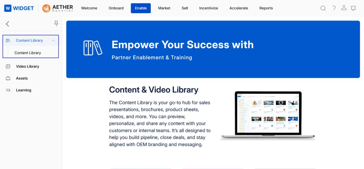
Introduction
ZINFI's UPM Library puts your sales and marketing collateral at your fingertips inside UPM. Easily access, customize, and share any piece of content from your UPM instance with your customers and end-users. The content library provides a secure repository for your files — from traditional business documents like presentations and Word files to audio files, video files, spreadsheets, images, and web pages.
Library as the Content Repository
Content is the potent strategy for keeping prospects engaged throughout the sales cycle. Through UPM's Library, teams can create and manage compelling collateral accessible and sharable across multiple digital channels — e-books, videos, banners, images, or customer stories. You can store files in fully searchable repositories known as resource categories. Partners can create multiple libraries, categories, and sub-categories, and then configure user permissions to balance content access with security.
Aligning the Sales Process
UPM helps you create an effective sales content library by streamlining buyer's purchases. By analyzing sales processes, you can align the right content for delivery, tag different assets to the channel lifecycle, and make it easy for salespeople to find relevant content depending on the stage of the funnel a lead is in.
Content Library
Accessing Content Library
- Click Enable from the top navigation menu.
- Click Content Library > Content Library in the left menu bar.
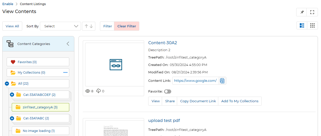
Navigating Content Library (View Contents)
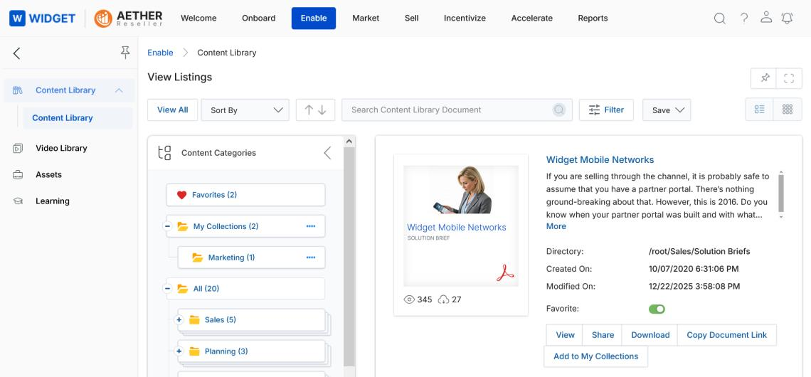
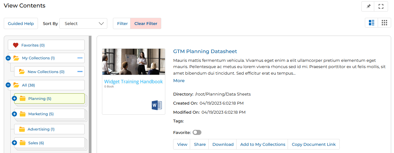
- Clicking Content Library from the left menu opens the View Listings page, where all the Contents of the library are displayed.
- The Content layout view is configured by the Admin in Library Settings. The Admin can configure either Default View or Folder View for partners.
- Click Sort By to sort documents by Created On, Modified On, Downloaded By, Viewed By, or Listing Name.
- The Sorting Order Buttons (Ascending ↑ / Descending ↓) enable users to quickly sort contents in ascending or descending order. Arrow indicators remain inactive when no criteria are selected.
- Selecting Default View lets the partner toggle between List View (lined icon, upper right) and Thumb View (waffle icon, upper right).
-
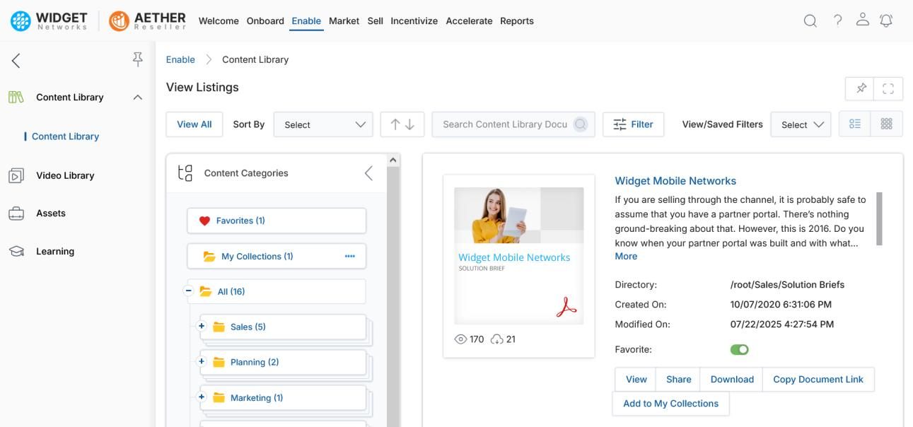
In both List View and Thumb View, the left-hand panel shows the Tree View category folders and their document counts in parentheses. Click any category or sub-category to filter the listing.
NOTE
Tree View is only available in Default View on the View Contents page, not in Folder View.
List View:
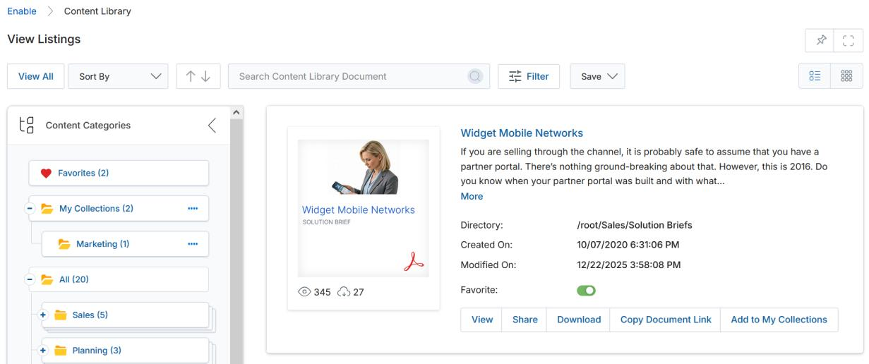
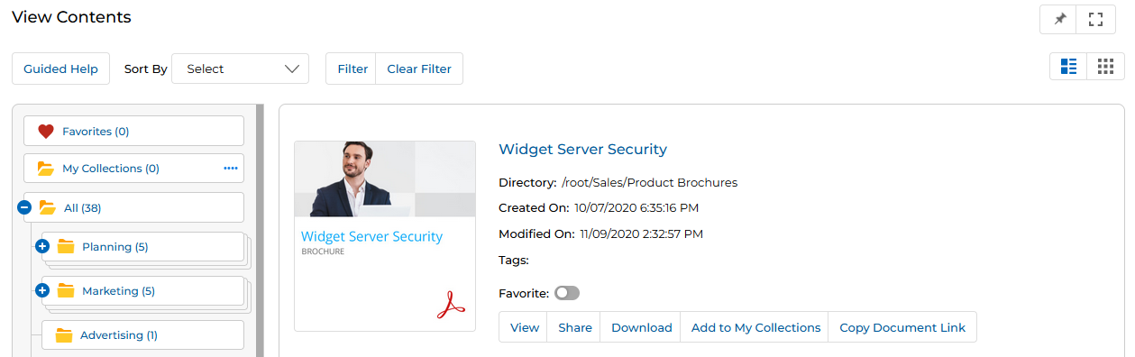
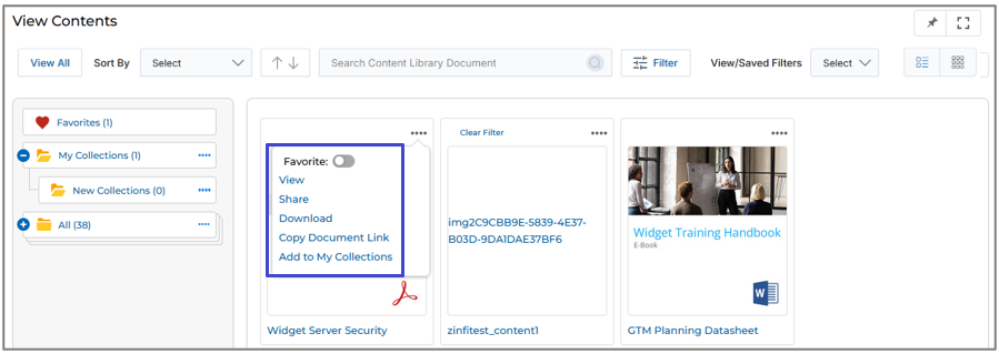
List View — action buttons (View, Share, Download, Copy Document Link, Add to My Collections) are visible directly on each content card. Thumb View:
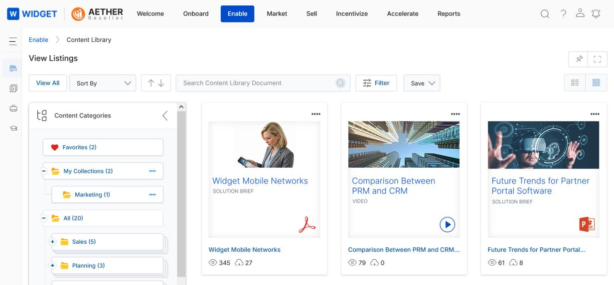
Thumb View — click the ⋯ menu on any card to access View, Share, Download, Copy Document Link, and Add to My Collections. -
Selecting Folder View (configured by Admin) lets the partner browse content via a Windows Explorer–style view composed of folder tiles representing Content Categories and Subcategories. Two tabs are available: All Contents and My Collections. The Favorites category is displayed separately on the right side of the page.
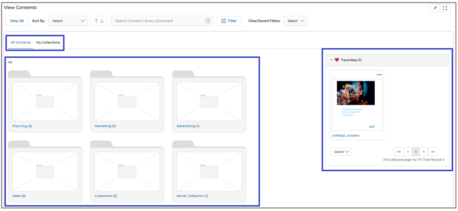
Folder View — category tiles with All Contents / My Collections tabs and a Favorites panel on the right.
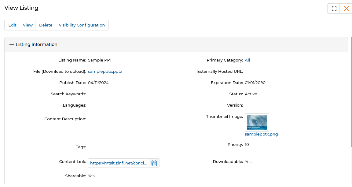
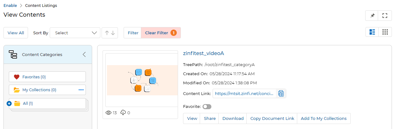
Content Listing — Field Descriptions
Each content card in the library displays the following information:
| Field / Element | Description |
|---|---|
| Thumbnail Image | Shows the thumbnail of the content piece. Clicking it opens a pop-up preview from where the document can be downloaded. |
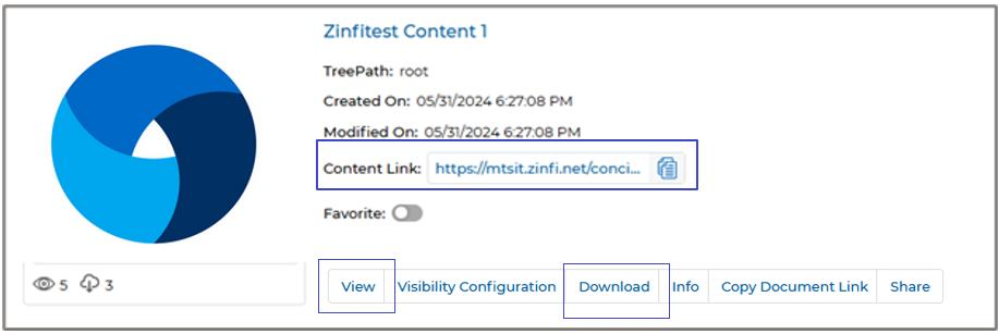
| Document Title | Title of the document. Clicking it also opens the pop-up preview window. |
| TreePath / Directory | The root URL address to this document in the portal's folder hierarchy. |
| Created On | The date the document was originally uploaded and created. |
| Modified On | The last date the document was edited or modified. |
| View Counter (👁 icon) | The content's total viewership count. Increments on each click of the View button, on each unique link open by an external user, and on each UPM Portal refresh. |
| Download Counter (⬇ icon) | Tracks how many times the content has been downloaded. Increments when downloaded from the Card List View or Preview Page. |
| Content Link | A direct URL to this content item. Can be copied and shared externally. |
| Favorite toggle | Enabling this toggle adds the document to the Favorites category in the Category Tree. Disabling it removes it. The Favorites count updates accordingly. |
Content Action Buttons
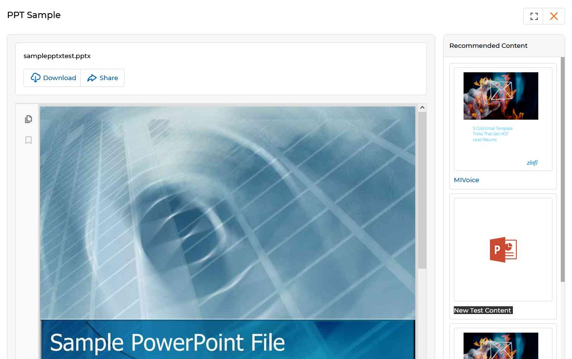
View — Opens a pop-up window with a full preview of the content. For document files (doc, ppt, pdf), the system allows downloading from the preview. For podcasts (audio) or video files, the preview window plays the file and offers a download option. Admin-recommended content is displayed in the right-hand panel of the preview.
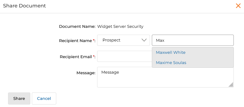
Share — Shares the content directly with a Prospect or Contact via email. Clicking Share opens the Share Document dialog.
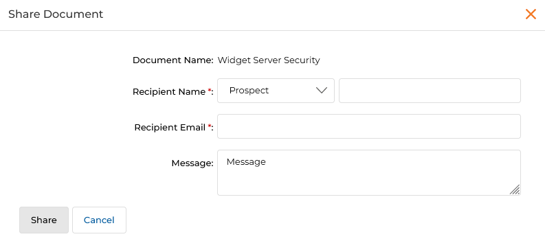
To select a recipient, type the first three characters in the name field to see a typeahead list of matching Prospects or Contacts. Once selected, the email auto-fills.
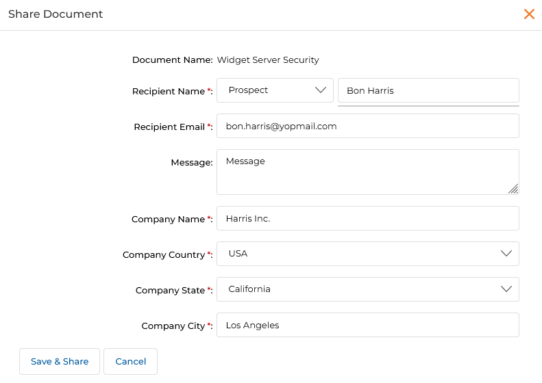
If the recipient does not exist, click Add as New to create a new Prospect or Contact. Additional fields appear — Company Name, Company Country, Company State, and Company City. Once filled, click Save & Share to create the record and send the content in one step.
Download — Downloads the specific content. Visibility of this button is configured by the Admin.
Add to My Collections — Adds the content to the partner's My Collections category (see Section 04).
Favorite toggle — Adds or removes the content from the Favorites category in the Category Tree.
Copy Document Link — Copies the content's public URL to the clipboard for embedding in external pages.
Filtering Content
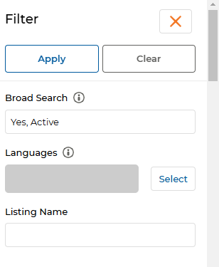
Click the Filter button to open the Filter pane on the right-hand side of the library. The pane can be closed by clicking the cross icon (X).
| Filter Field | Description |
|---|---|
| Broad Search | Searches content by any parameter value (Listing Name, Status, Publish Date, Tags, Languages, etc.). Supports multiple keywords separated by commas. Works for both manually created and bulk-uploaded content. |
| Languages | Filters listings by the language(s) the documents are assigned to appear in. |
| Search Keywords | Filters by keywords associated with the document. |
| Tags | Filters by tag words associated with the document. |
| Listing Name | Searches by the exact or partial name of the listing. Particularly useful in folder-based search. |
After setting the required parameters, click Apply or press Enter. The Clear option removes all filters and returns the full Content Library.
Broad Search results can be validated by going to the details page of a matched content item — the searched terms will appear in the relevant searchable fields.
Folder-Based Search & Collapsible Tree View
Folder-Based Search in Card View with Category Tree
The folder-based search functionality enhances document discovery by allowing users to search within specific folders for more targeted results. This reduces time spent navigating irrelevant content and enables efficient access within selected folders.
- Select a folder in the collapsible tree panel on the View Contents page by clicking on it (the selected folder is highlighted).
-
After selecting the folder, click the Filter button. The selected folder's name is automatically populated in the Category field, and the total number of documents within the folder is shown in parentheses.
Category tree with selected folder — the content area shows only documents within that folder. 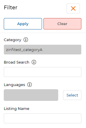
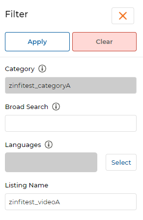
Filter pane after folder selection — the Category field is auto-populated with the selected folder name. - Enter the document name in the Listing Name field and click Apply to search within the selected folder.
Folder-based filter — Category pre-filled plus Listing Name entered for targeted search. -
The matching document from the selected category is retrieved and displayed on the listing page.
Folder-based search result — only documents matching the name within the selected category are returned. -
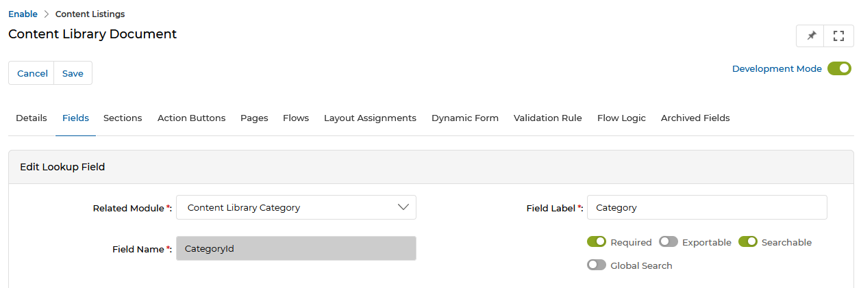
To enable folder-based search, the Category lookup field must be marked as Searchable in the Workflow application, and the IsFolderSearchEnable setting must be set to "True" in the Portal Settings application.
Workflow setting — Category lookup field must have Searchable enabled for folder-based search to work. NOTEThe folder-based search feature is integrated across all applications using card view, including Learning and Co-Brandable Assets, allowing efficient category-tree navigation in all those modules.
Collapsible Tree View Panel
The Category Tree on the View Contents page can be expanded or collapsed at any time to control how much space the tree occupies. The content section presentation adjusts automatically based on the tree state.
- Click the arrow associated with Content Categories to compress the tree, expanding the content area to full width.
- Click the arrow again to restore the tree panel.
- UPM retains the tree's last-used state — when you next log in, it opens in the same expanded or collapsed state.
My Collections
My Collections is a personal workspace category available in the hierarchical Tree View. It allows partners to curate a personal library of content copied from other categories, organize it with sub-categories, and share entire collection folders with Prospects or Contacts via email.
My Collections is only available to partners if the Admin enables it via the Library Settings page in the Admin portal.
-
The My Collections category appears in the Tree View on the left side of the View Contents page. Initially it is empty.
View Contents — click Add to My Collections on any content card to start building your collection. -
Clicking Add to My Collections opens the Add to My Collections panel from the right, showing available Collection Categories.
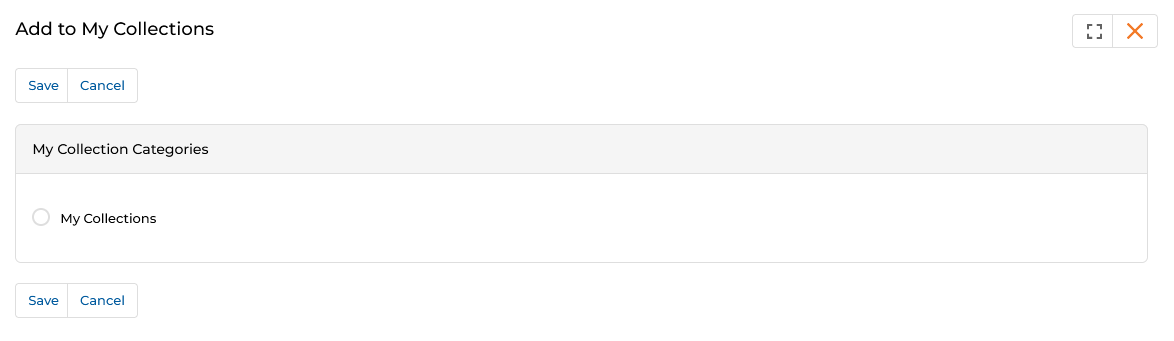
Add to My Collections — select the target collection and click Save. - Select the My Collections radio button and click Save. The content is copied to My Collections.
-
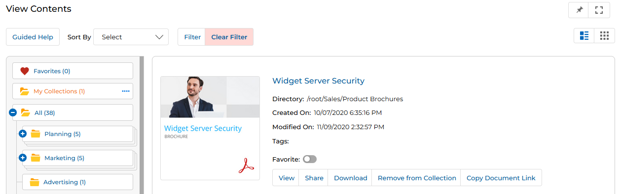
Navigate to the My Collections category in the tree to see the copied content. A Remove from Collection button appears on the content card, allowing you to remove the copy.
My Collections view — content in the collection shows a Remove from Collection button instead of Add to My Collections. -
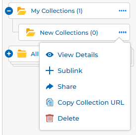
In the View Contents page, the four dots (….) menu associated with the My Collections category provides four options:
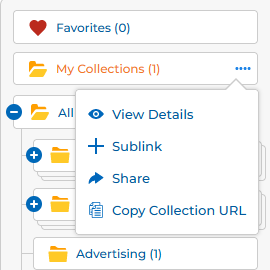
My Collections ⋯ menu — access View Details, Sublink, Share, and Copy Collection URL. - View Details — Opens the View My Collection Information window showing collection metadata and its contents list.
- Sublink — Quickly creates a new Collection Sub-category under My Collections.
- Share — Shares the entire Collection folder with a Prospect or Contact via email.
- Copy Collection URL — Copies the Collection category URL to the clipboard for sharing.
-
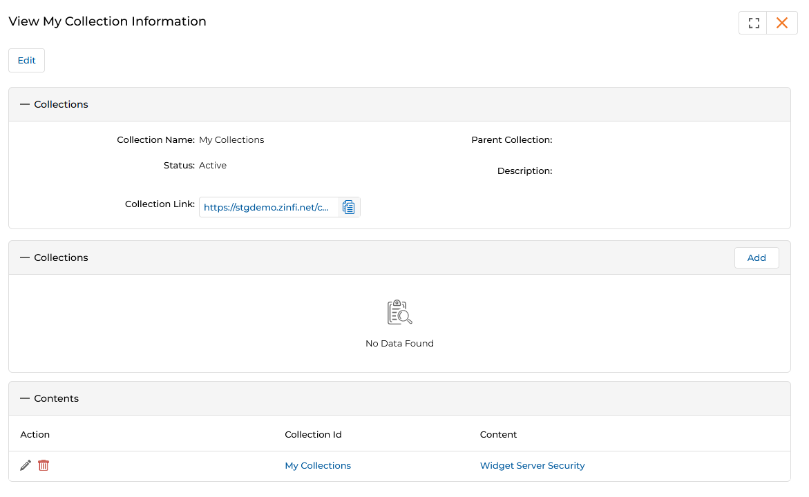
Clicking View Details opens the View My Collection Information window, which contains three sections:
View My Collection Information — three sections: top-level collection details, sub-collections list with Add, and contents table. -
Collections section (header) — Displays the collection's details:
- Collection Name — Name of the Collection Category.
- Parent Collection — Whether a parent category exists in the hierarchy.
- Status — Active, Inactive, or Draft.
- Description — A brief description of the category.
- Collection Link — A shareable URL for direct access to this collection's contents.
-
Collections section (sub-collections) — Manage Sub-categories. Click Add to open the Content Library Collection page and create a new Sub-category.
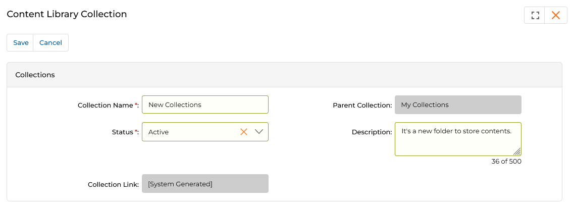
Creating a sub-category — specify Collection Name, Status, Parent Collection, and an optional Description. -
Contents section — Lists all content items in the collection, linked by name for quick preview or download.
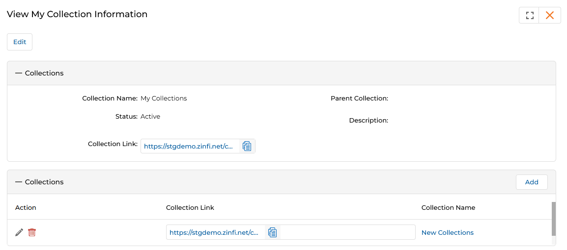
After adding a sub-category, it appears in the Collections table with its own Collection Link and edit/delete actions.
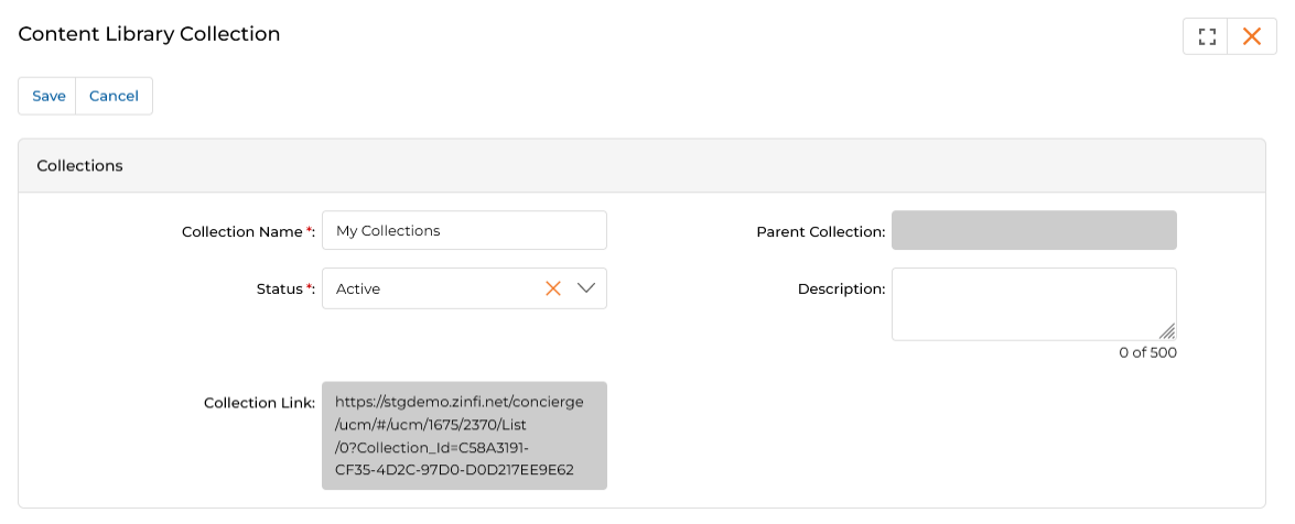
Edit Collection — update the Collection Name, Status, or Description from this page. -
Collections section (header) — Displays the collection's details:
-
Clicking Share from the dots menu opens the Share Collection Folder dialog.
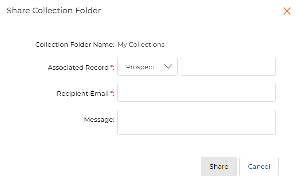
Share Collection Folder — select the recipient type, enter their name (typeahead), and add an optional message. - Collection Folder Name — Auto-populated with the collection's name.
- Associated Record — Select Prospect or Contact from the dropdown.
- Type the first three characters of the recipient's name; their email auto-fills when selected.
- Click Share to send the collection link via email.
- Clicking Copy Collection URL from the dots menu copies the Collection Category URL to the clipboard for sharing with other users.
-
When clicking the four dots on a Collection Sub-category (not the parent), the menu includes an additional Delete option. Clicking Delete removes that sub-category. The Delete option is not available for the parent My Collections category.
Sub-category ⋯ menu — includes a Delete option not available on the parent My Collections folder.
View Content Details & Bookmarks
View Content Details
Every document in the View Contents page has a View button. In List View, the button is visible directly on the card. In Thumb View, click the three dots (⋯) on the card to reveal the View option.
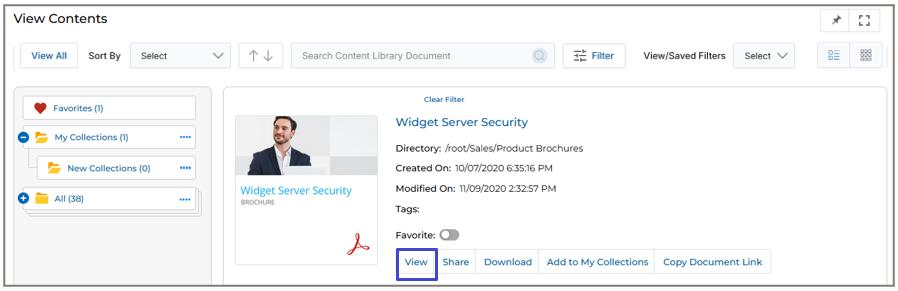
Clicking View, the Thumbnail Image, or the Document Title opens a pop-up preview window where you can scroll through pages or slides. Admin-recommended content appears in the right-hand panel.
For document files (doc, ppt, pdf), the preview offers Download and Share at the top. For audio or video content, the preview plays the file inline with a download option.
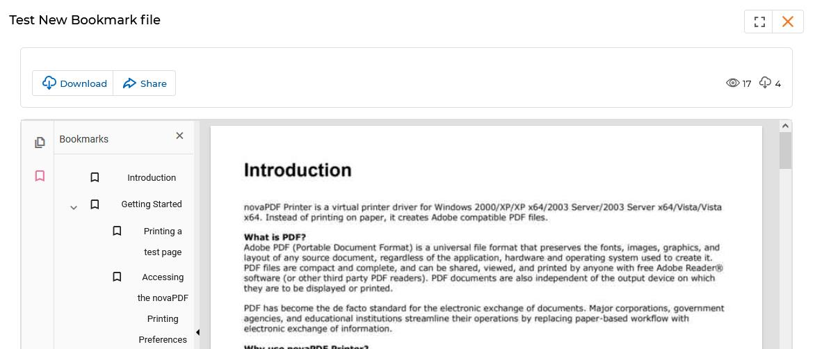
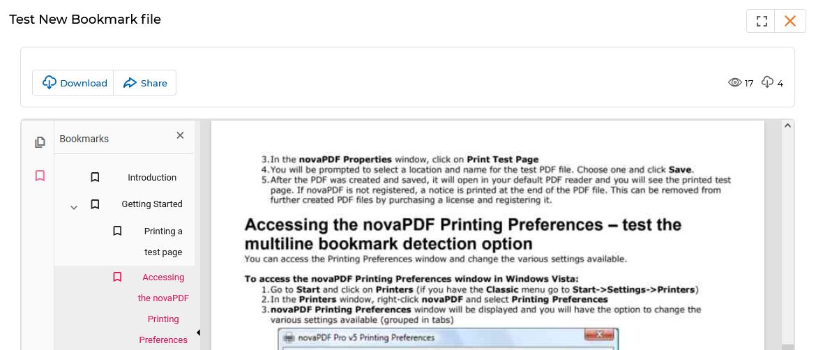
View Bookmarks
Admin can upload PDF content to the Content Library with Bookmarks embedded. Bookmarks act like a table of contents, letting users jump instantly to specific sections, chapters, or headings within the document without scrolling.
- Bookmarks are typically displayed in a collapsible sidebar within the PDF preview window.
- Clicking any bookmark entry moves the PDF view directly to the corresponding section.
- Nested bookmarks (sub-headings) are supported and displayed as an indented tree.
Video Library
The Video Library stores and organizes your vendor-provided video content. It uses the same Tree View hierarchy as the Content Library but is focused on video assets rather than documents.
Accessing Video Library
- Click Enable zone from the top menu.
- Click Video Library > Video Library in the left menu bar.
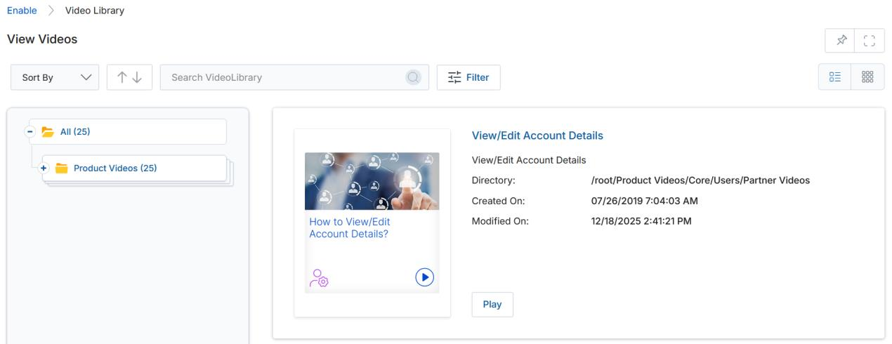
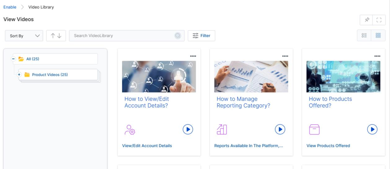
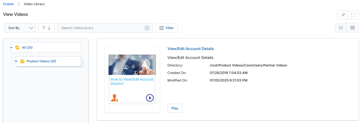
View Videos
- Clicking Video Library from the left menu opens the View Videos page, where all videos are displayed in List View or Thumb View.
- Clicking on Tree View category folders on the left helps find videos quickly. Numbers in parentheses indicate how many videos are in each category. Click any category or sub-category to filter the listing.
- Click List View or Thumb View to change the visual arrangement.
-
Click the dropdown arrow in the Sort By box to sort videos by Created On or Modified On.
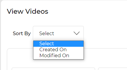
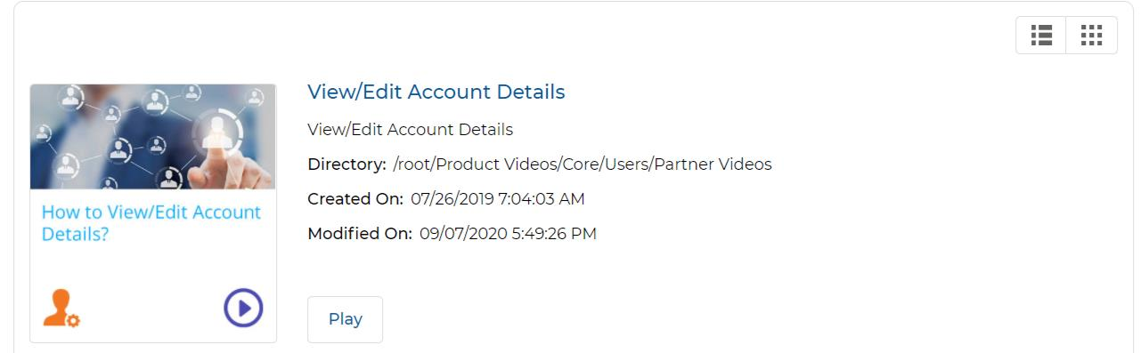
Video Sort By dropdown — Created On or Modified On. - Each video card displays the following fields:
| Field | Description |
|---|---|
| Thumbnail Image | Displays the thumbnail of the video clip. |
| Video Title | Shows the title of the video. |
| Description | A short description of the video. |
| Directory | The root URL address of this video in the portal. |
| Created On | The date the video was originally uploaded. |
| Modified On | The last date the video was edited or modified. |
| Play button | Opens a pop-up window and plays the video. The popup shows Overview, Transcript, Released On, Duration, and Language tabs. |
-
Click Filter to open the video filter pane, which provides the following search parameters:
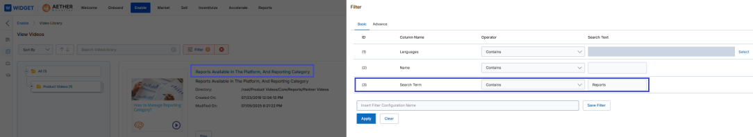
Video Filter panel — supports filtering by Language, Name, Country, and Search Term with operator choices. - Country — Filter videos by geographic location.
- Language — Filter by the language the video is presented in.
- Name — Search for a specific video by title.
- Search Term — Search video titles or descriptions by keyword.
Click Apply or press Enter to run the filter. Use Clear to remove all filters and return the full video listing.
View Video Details
- Click the name of any video in the library to open its detail page.
-
The View a Video page shows full information about the video:
Click the video name link in the listing to open the View a Video detail page. 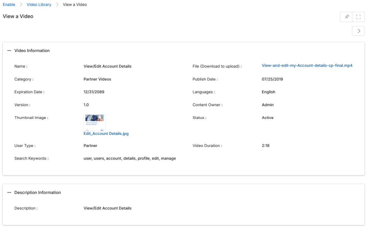
View a Video — Video Information and Description Information sections with all metadata fields. - The Video Information section contains the following fields:
| Field | Description |
|---|---|
| Name | The name of the video. |
| Category | The category in which the video is assigned. |
| File | The file attached to the video. |
| Insert URL | Shows if the video is accessible via an external URL. |
| Publish Date / Expiration Date | Publishing and expiry dates of the video file. |
| Sort Order | The position at which the video appears in the listing within its category. |
| Status | Whether the video is Active or inactive for viewing. |
| Language | Languages tagged with this video. |
| Version | The version number of the video. |
| Restrictions | Any restrictions or warnings for the viewer. |
| Intended Audience | Who is authorized to watch this video. |
| Solution | Whether this video is tagged to any Product or Solution from the OEM. |
| Content Owner | The person who uploaded the video. |
| Job Role | Any job role tagged with this video. |
| Technology / Organization | Technology or Organizational process tags. |
| Region / Country | Regional or country-specific tags. |
| Thumbnail Image | The image displayed as the video thumbnail on the listing page. |
| Search Keywords | Keywords tagged to help search for this video. |
| Video Duration | Video length in minutes and seconds. |
| Description | A full description of the video content. |