

Overview
In the Market module, UI/UX Packages are fundamental for maintaining brand consistency and providing a professional appearance for partner-facing marketing assets. These packages encapsulate all the necessary design elements—CSS stylesheets, JavaScript files, and images—that dictate how microsites, landing pages, and other portal components are rendered. By centralizing these elements, administrators can ensure that all co-marketing materials align with the vendor's brand guidelines, even when customized by partners.
Administrators can create multiple UI/UX packages, each tailored for different purposes or partner segments. For instance, a vendor might have a specific package for product launch landing pages and another for general resource center pages. The ability to assign a package as the 'Default For Portal Pages' streamlines the setup process, ensuring a baseline design is applied automatically. This structured approach to UI/UX management empowers partners to create branded content efficiently while giving vendors full control over the visual integrity of their ecosystem.
Viewing UI/UX Packages
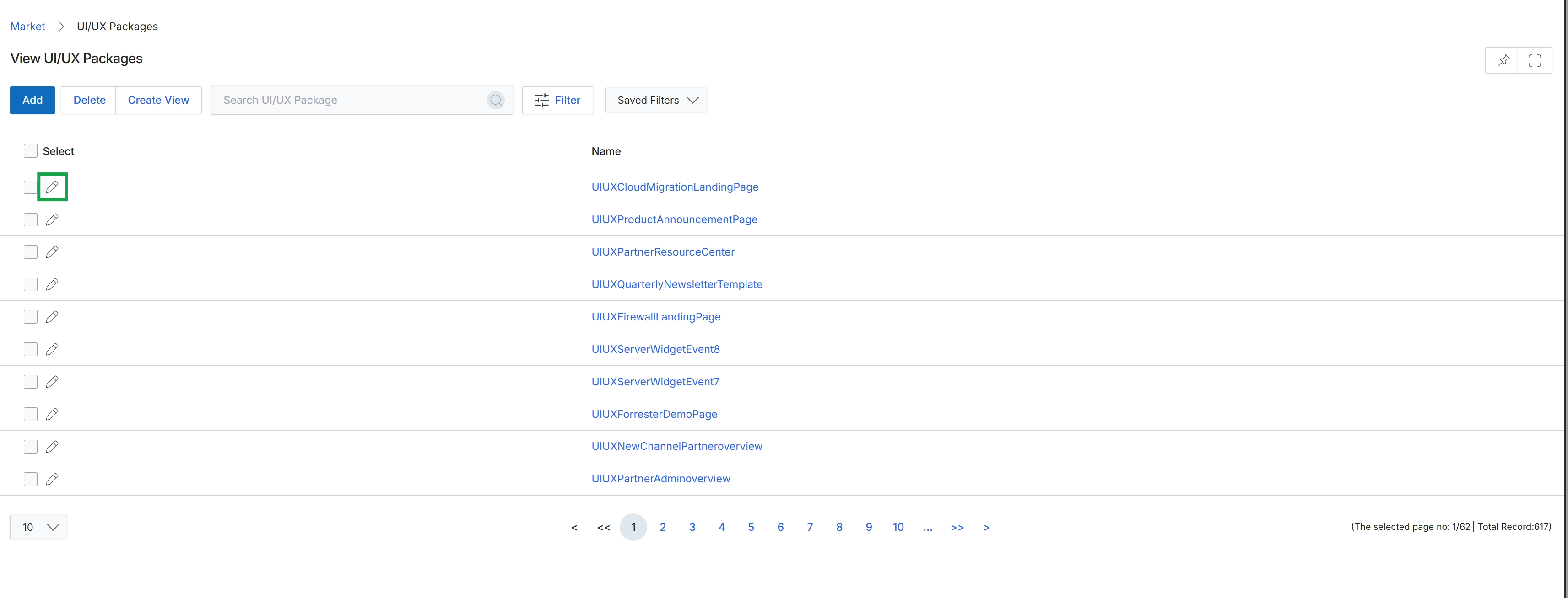
Click the pencil icon next to "UIUXCloudMigrationLandingPage" to edit it.
Adding or Editing a UI/UX Package
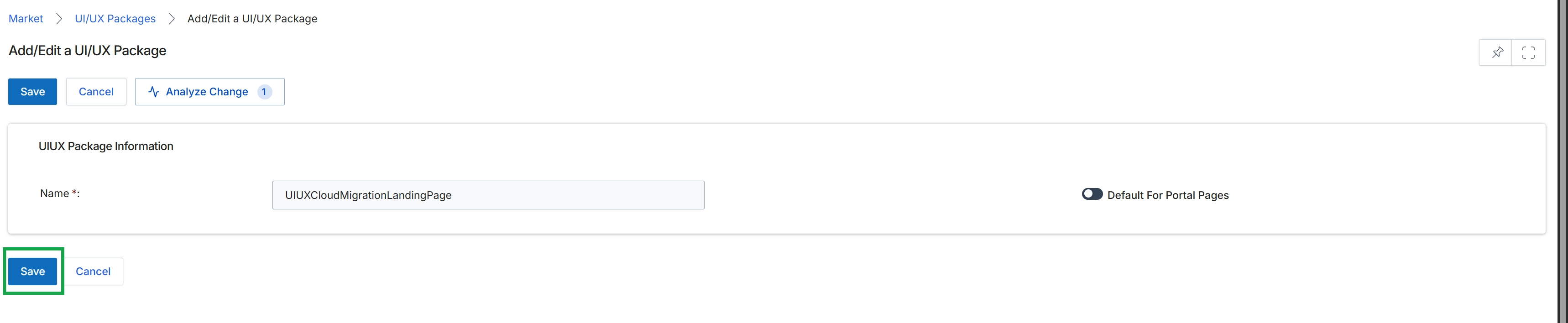
This screen presents the Add/Edit a UI/UX Package form, which administrators use to define or modify UI/UX packages within the Multi-touch Campaigns module. These packages are crucial for maintaining consistent branding and user experience across partner-facing portal pages and campaign assets, such as microsites or email templates. The form allows administrators to assign a unique name to each package and designate whether it should serve as the default for all partner portal pages. This ensures that a standardized visual and interactive experience is applied unless overridden by a specific campaign's settings. The inclusion of an 'Analyze Change' option suggests a mechanism for administrators to assess the potential impact of their modifications before committing them, which is vital for managing complex design configurations and avoiding unintended consequences across the partner ecosystem.
Click the "Save" button to save the changes made to the UI/UX Package.
Buttons
| Button | Description |
|---|---|
| Save | Saves the current configuration of the UI/UX Package. |
| Cancel | Discards any unsaved changes and returns to the previous screen. |
| Analyze Change | Analyzes the impact of the proposed changes before saving. |
UIUX Package Information
| Field | Description |
|---|---|
| Name * | The name of the UI/UX Package, which is a mandatory field. |
| Default For Portal Pages | A toggle to designate this UI/UX Package as the default for all partner portal pages. |
Managing Package Details
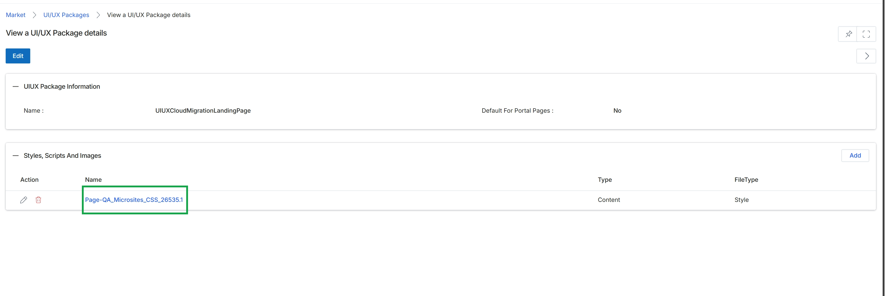
This screen displays the detailed configuration of a selected UI/UX Package, which is a collection of visual assets like styles, scripts, and images used to define the appearance and functionality of microsites or other partner-facing pages within the Market module. Administrators utilize this view to examine the package's core information, such as its name and whether it is designated as the default for portal pages. Additionally, the screen provides a comprehensive list of all individual style sheets, scripts, and images bundled within the package, offering a granular overview of the assets that contribute to the branding and user experience delivered to partners through co-marketing initiatives.
Click the 'Edit' icon next to the file name "Page-QA_Microsites_CSS_26535.1" to modify its details.
Buttons
| Button | Description |
|---|---|
| Edit | Allows modification of the UI/UX Package details. |
| Edit | Allows editing of the individual style, script, or image file. |
| Delete | Deletes the individual style, script, or image file from the package. |
| Add | Adds new styles, scripts, or images to this package. |
UIUX Package Information
| Field | Description |
|---|---|
| Name | The name of the UI/UX Package. |
| Default For Portal Pages | Indicates whether this package is set as the default for portal pages. |
Styles, Scripts And Images
| Column | Description |
|---|---|
| Name | The name of the style, script, or image file. |
| Type | The type of content, such as 'Content'. |
| FileType | The file type, such as 'Style' for CSS files. |
Viewing Style and Script Information
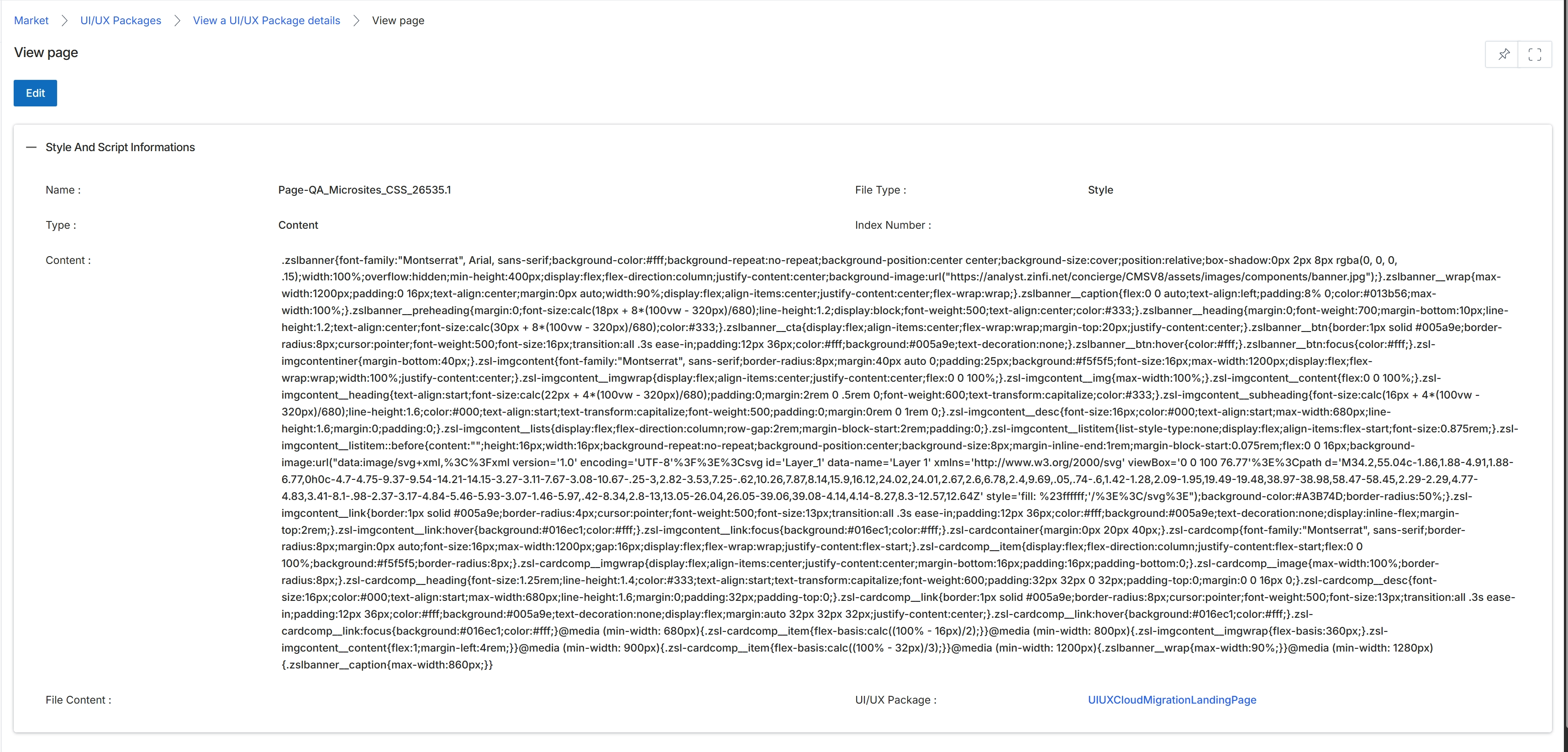
This screen displays the detailed information for a selected UI/UX Package, which is a component used within the Market module to define the style and script for various marketing assets like microsites. These packages encapsulate design elements and code, ensuring consistent branding and functionality across partner-facing marketing materials. Administrators use this view to review the specific content and properties of a UI/UX Package, such as its name, type, and the actual code or content it contains, before it is applied to campaigns or microsites. This detail view is crucial for verifying the integrity and correctness of the package's definition.
Review the details of the selected UI/UX Package.
Buttons
| Button | Description |
|---|---|
| Edit | Click to modify the details of this UI/UX Package. |
Style And Script Informations
| Field | Description |
|---|---|
| Name | The name of the UI/UX Package, typically indicating its purpose or the asset it applies to. |
| Type | The classification of the UI/UX Package, such as 'Content' or 'Style'. |
| Content | The main content or code of the UI/UX Package, which can include CSS, HTML, or other script information. |
Fields
| Field | Description |
|---|---|
| File Type | Indicates the type of file or content contained within the package, such as 'Style'. |
| Index Number | A numerical identifier for the file within the package. |
| File Content | The detailed content of the file, which can be extensive code or text. |